
Mtn Dew Energy Advertisement
Advertising product line concept: Advertising Design class


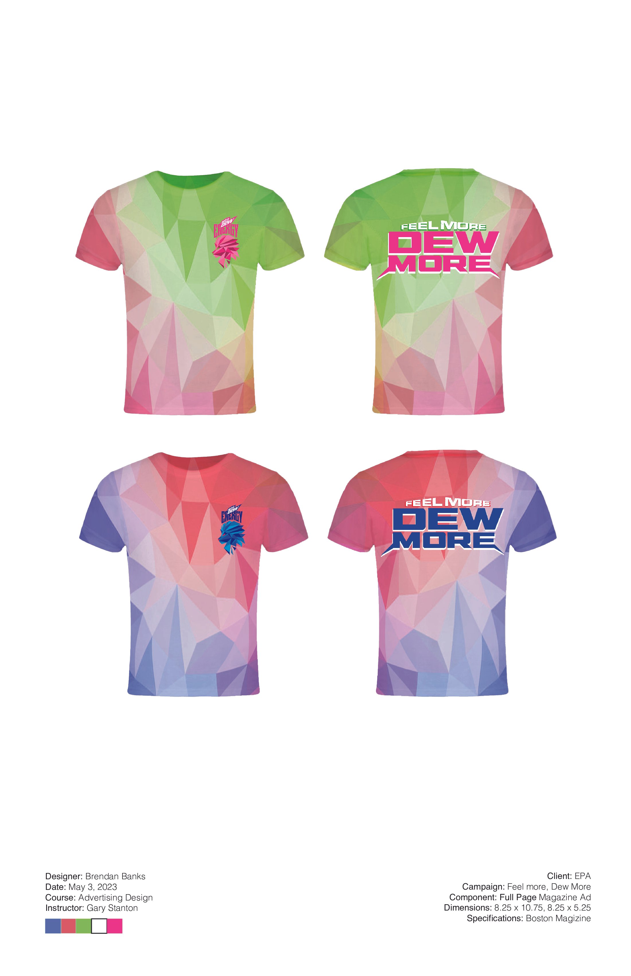
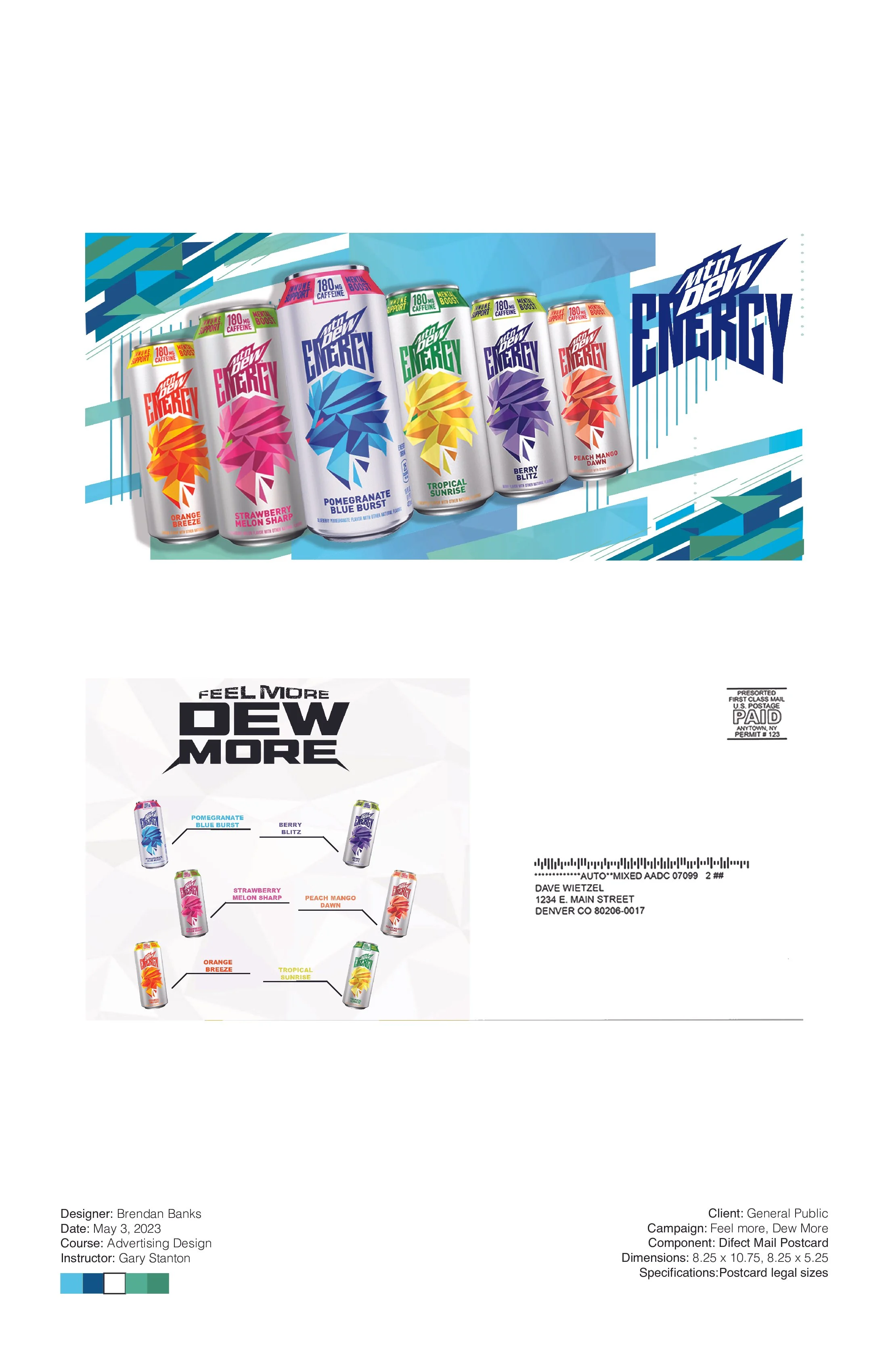
For this piece, I was tasked with creating an advertisement centered around a product line of my choosing, that would hypothetically be distributed across multiple different platforms, including billboards and t-shirts. While each market required its own adjustments to fit within the parameters of what would be appealing to someone who is looking at that specific advertisement, overall I wanted to capitalize of the the drink’s geometric and dynamic feel, as shown by the Lion on the box. It must be noted that the way in which the company markets this drink is more in line with how they market their normal drink, with paint and a hip-hop aesthetics. Most of the geometry that can be found in the pieces are angular to fit with a dynamic feeling, and the colors are all offset with the specific colors on the cans themselves. The way in which they are angled is dependent on the surface they are being displayed on (for instance, the ads that are meant to appear on the phone are vertical, though the ones that are on the computer are horizontal). The tagline of ‘Feel more, Dew more’ is a play on words for Mountain Dew that acts as a callout for consumers, suggesting the additive energy that one can feel from digesting the beverage. I hope that when looking at these pieces, it entices one to get the drink through the energizing colors on display.